SPAM®’s new look: fresh, fun, and full of flavor!
Web Design
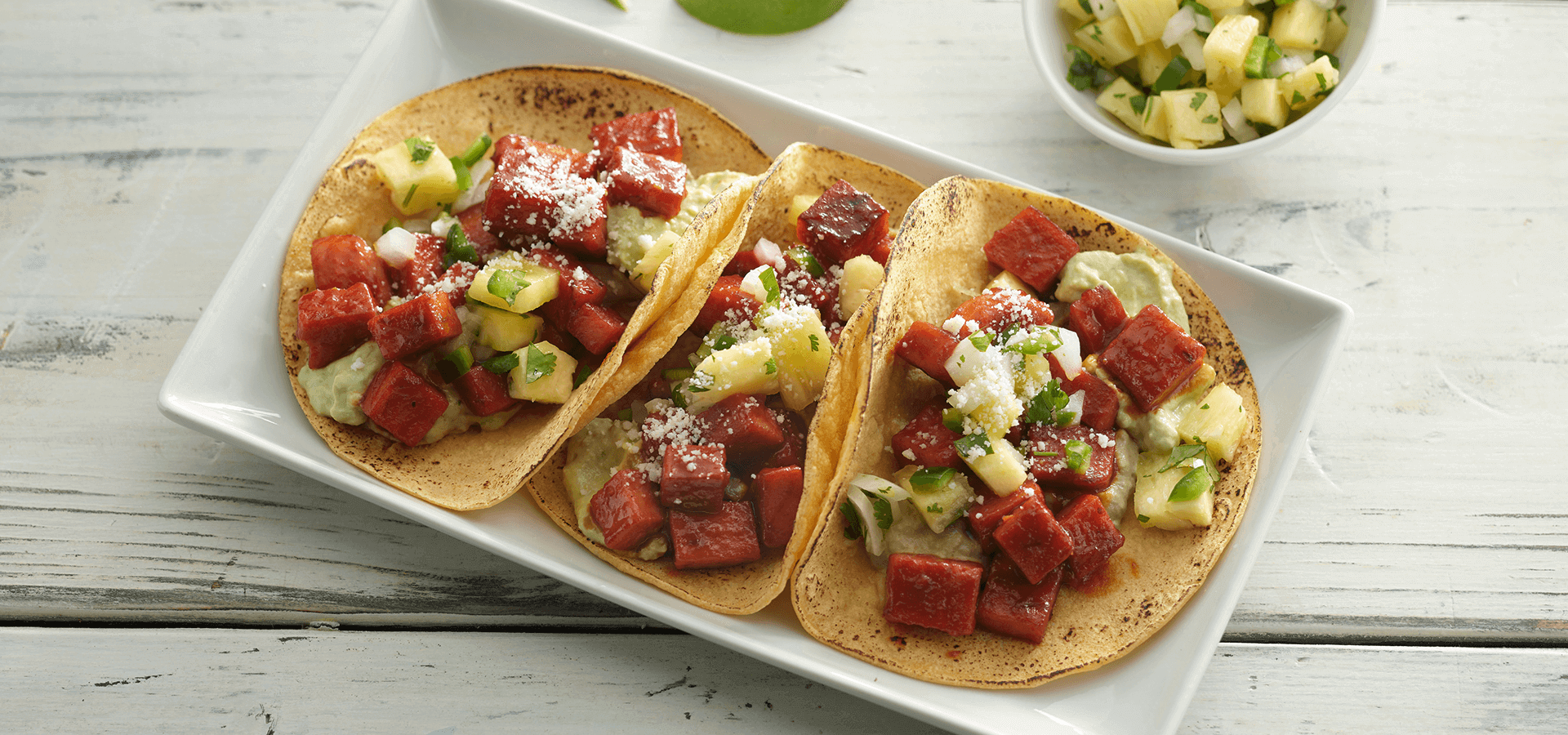
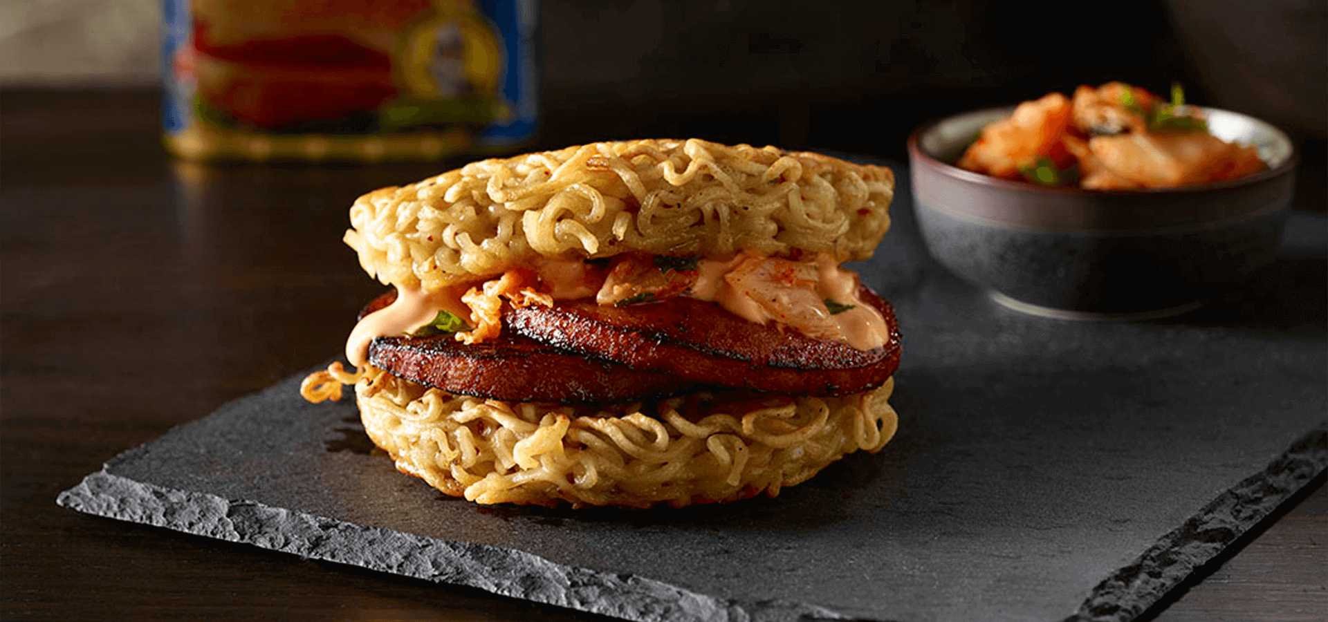
SPAM® has been sizzling for over 80 years, making a worldwide impact from the U.S. to Japan, Australia, the UK, and beyond. With a loyal fanbase, we’re firmly on team “love it”! Especially when it’s that delicious sizzly goodness! Sold in 41 countries and boasting 20+ varieties, SPAM® lives by its motto: “Don’t knock it ‘til you’ve fried it!”
Client
SPAM®
Role
Lead Visual Designer
Responsibilities
UI/UX, Branding
What’s the issue?
The website’s cluttered design overstimulates the eyes, making navigation difficult due to a lack of white space and poorly organized sections.
Without proper cross-linking, users struggle to explore further, leading to high exit rates. Out of 879,595 visits, only 10,454 users returned, resulting in a 69% bounce rate. In the past year, 1 million visits saw 78% of users leave immediately.
The Challenge
Redesigning the SPAM® website to improve usability, increase brand awareness, and lower bounce rates.
The Solution
A fresh visual design that declutters the site and encourages users to explore products, recipes, and learn more about their favorite food.
Let’s review what we’re starting with
The current site map shows dead-end links causing user drop-off, and the ‘Shop’ page redirects externally. We aim to fix these issues to reduce drop-off and improve user navigation by:
Adjusting what is directly shown in the header navigation
Putting secondary information in the footer navigation
Implementing strong and apparent cross linking from page to page

Site Check Up
We took a look at all of the pages and reviewed what the pain points of the website were and how the pages could improve.
For example, this is an analysis of the original SPAM® home page.
Sizzling up something new
By revising the site map (shown below) we:
Streamlined the navigation
Added in a new section called “SPAM® Brand Life”—letting users know about the fun exciting events and posts that come with enjoying SPAM® (like an extension of their social media)
Cross linking from page to page for ease on the user experience to correct dead end pages

We ate it,
Now we made it (new)!
After reviewing the site’s drop-off points and identifying opportunities for cross-linking, we created a wireframe mockup to restructure the SPAM® website. With improved navigation, cross-linking, and photography, users can explore the site longer and stay engaged.
New SPAM® Home Page
New Selected Variety

New Selected Variety
Other Ways to See Varieties
We added the "Other SPAM® Flavors" section to let users easily browse different varieties without scrolling or navigating back. This hover feature boosts cross-linking and awareness of SPAM®'s full range. Plus, an image links directly to SPAM®’s Instagram, showcasing user-generated content.
Additional Pages
Where to Buy
The new ‘Where to Buy’ page lets you quickly find SPAM® at stores like Safeway, Kroger, or Aldi. Need it? Just check and go!
Restaurants
SPAM® is popping up in more places than we realize! The new ‘Restaurants’ page helps you find spots across the U.S. serving SPAM® dishes, kind of like Yelp but for all things SPAM®. Plus, users can add their own finds, spreading the SPAM® love even further!
SPAM® Brand Life
SPAM® Brand Life brings the fun from their social media to the website, featuring images, videos, and stories that keep fans updated on events and spamtastic happenings! It's a nod to the original, quirky homepage with a modern twist.
Here are some GIFs I created for the SPAM® Brand Life page with assets the brand provided were also uploaded to their page as well.


SPAM®tastic Results!
The revamped SPAM® website makes it easy and fun for users to hop between products and recipes. With a 21% drop in bounce rate, the new design offers smooth flow, plenty of white space, and cross-linking to keep users exploring. No more overwhelming visuals, just a tasty, seamless experience!