Southern barbeque for everyone to enjoy
Web & Brand Design
Role
Lead Visual Designer
Responsibilities
UI/UX, Branding
Client
Sadler’s Smokehouse
For over 70 years, Sadler’s Smokehouse in East Texas has been serving up smoky, backyard-style BBQ perfection. Once a local secret, now a flavor-packed favorite taking the internet by storm.

What’s wrong?
Sadler’s Smokehouse serves you with smoked meat that leaves you wanting more, however, the experience to get your cravings satisfied falls flat and leaves users confused and annoyed.
The user experience of the site falls flat:
User drop off rates are as high as 87%
Poor navigation making it difficult to switch from page to page
Boxes and text that look clickable are only accessible through small
arrow icons
Links leading to dead end pages leading user drop off rates to
sky rocketHigh contrast colors straining the eyes at times
Difficult shopping experience
Products that only describe the product without having an area
to purchase the product
The Challenge
Revamp Sadler’s brand and website to hook visitors, cut bounce rates, and turn clicks into customers.
The Solution
A new visual experience that expresses the mastery of Sadler’s smoked meats that encourages users to purchase their meats for any occasion.
Sometimes the original isn’t the best
The original sitemap of the website (shown below) was short and sweet but failed to reach the effectiveness of what a navigation bar should do:
Navigation only had 2 accessible links
“Shop” or point of purchase was difficult to find
Many pages lead to dead ends creating user drop off
‘Recipes’ and ‘Quality’ did not live in the navigation making the search for each topic a pain point

Site Analysis
We took a look at all of the pages and reviewed what the pain points of the website were and how the pages could improve.
For example, this is an analysis of the original Sadler’s Smokehouse home page.

New recipes page
Let’s freshen up and get smokin’

We revamped the sitemap to make navigation a breeze and spiced things up with real pitmaster stories, tasty BBQ trivia, regional meat favorites, prep tips, and pages so easy to find, they practically click themselves.
The new site brings the brand to life with bold photography, crave-worthy products, and tasty recipe links just a click away.
New home page
New product page
Marinating the meat results in good food
Once we figured out the issues, we were able to move forward with wireframes. With the prototypes revised we were able to get a direction that allowed users to enjoy their experience on the website and go from page to page easier. Giving the brand a refresh also allowed the brand to have a new tone of voice with a new sense of identity.

Cooking up new pages
In terms of refining the navigation, we wanted to add a few pages that really accentuate the brand story and help users know the roots of certain cuts of meat originated from and to expand their knowledge on the history of barbecue.
Heritage Page
The Heritage Page serves up the story behind Sadler’s Smokehouse, from family roots and 70+ years of BBQ mastery to the smoky innovation that made them a legend.
BBQ 101
BBQ 101 breaks down East Texas barbecue, Sadler’s style, real smoke, no shortcuts. From prep to that perfect smoky flavor, it’s a crash course in what sets the pros apart from the pretenders.
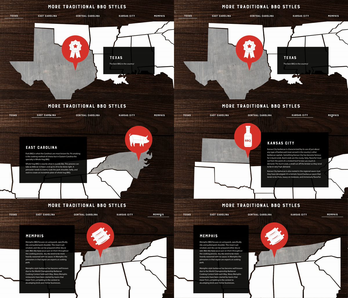
Where is that BBQ from?
We added a tasty interactive twist—clickable BBQ hotspots that dish out fun facts on regional styles and the cuts that made them famous.

Heating Guides
To help BBQ lovers recreate that fresh-from-the-smoker flavor at home, we added handy heating guides online and in every box.
Because perfectly warmed meat = happy bellies all around.

Leaning into Sadler’s new style
Original photography
The original photos felt dull and outdated, lacking the juicy, mouthwatering appeal that truly captures Sadler’s bold BBQ legacy.
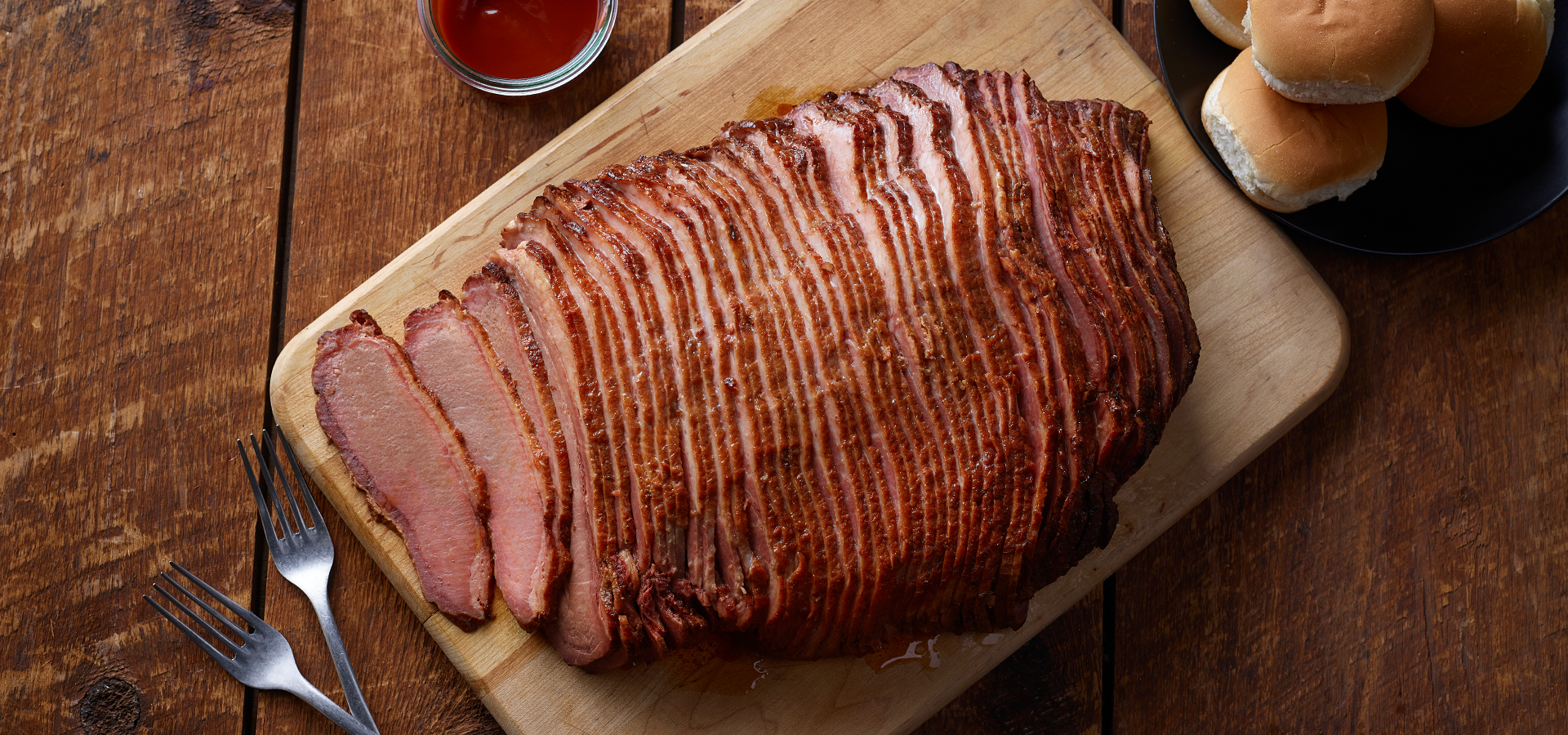
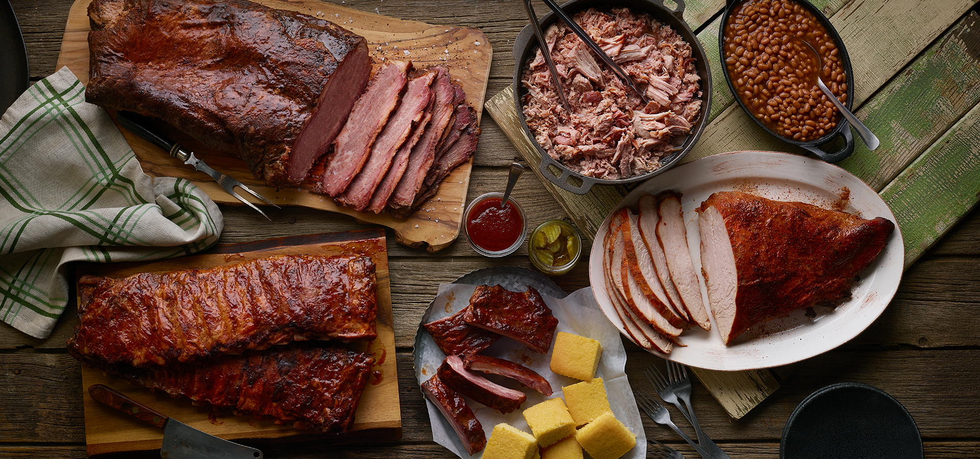
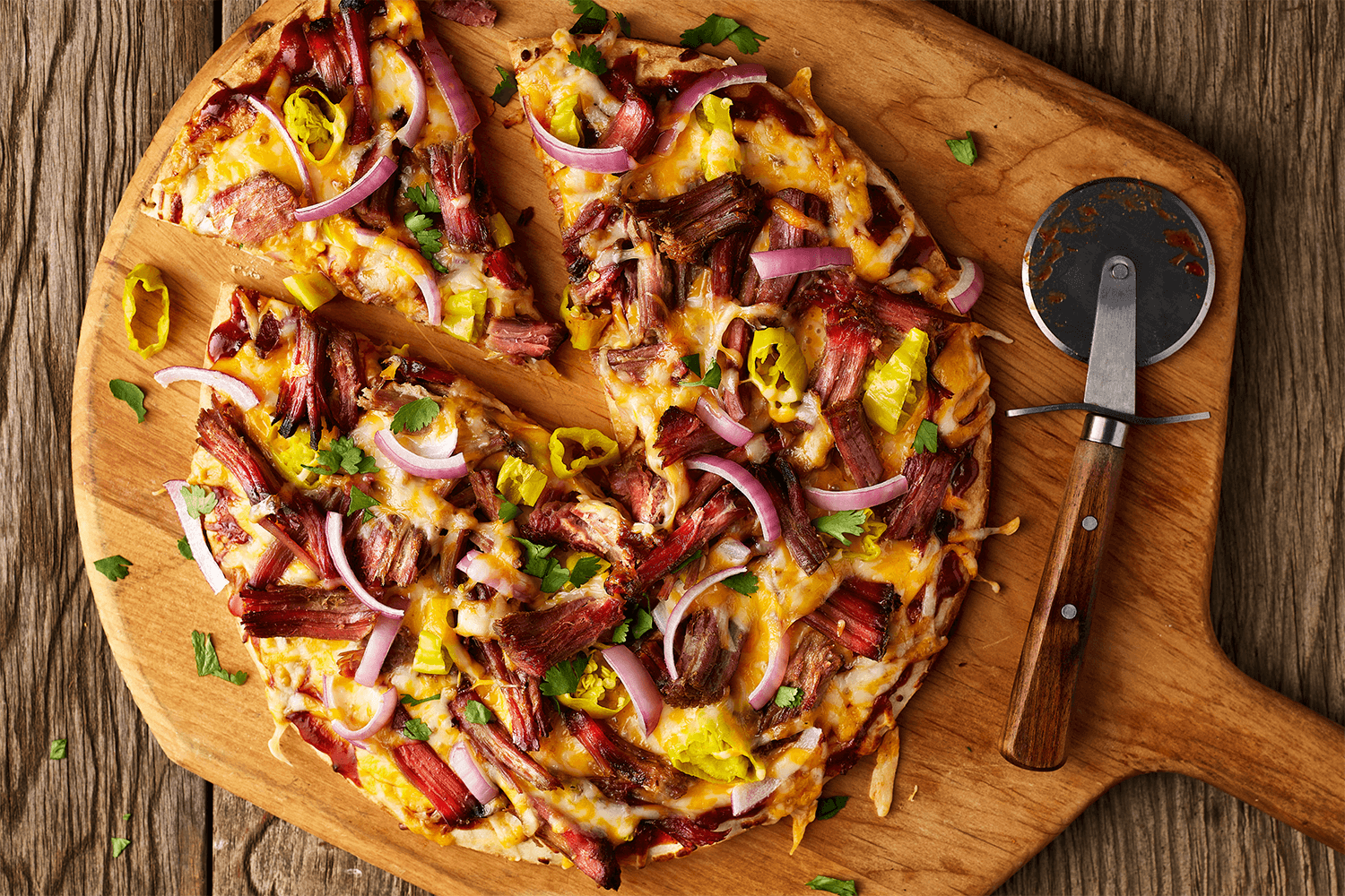
New photography direction
Rustic, wooden, backyard vibes paired with juicy smoked meats bring Sadler’s rich history and bold flavors to life, showcasing their BBQ craft and recipe-ready products.


