Sadler’s Smokehouse Website Redesign & Holiday Campaign
Project
UI/UX, Branding, Web Design
Role
Lead Visual Designer
Client
Sadler’s Smokehouse
With over 70 years of experience and located in East Texas, Sadler’s Smokehouse is a company with mastery skill level when it comes to the barbecuing and smoking their meats to give their smoked meats that backyard barbecue flair. Popularity was gained through word of mouth back in the day and now in modern day we have the internet to attribute to the spread of news of the delicious cuts of meat Sadler’s has to offer.
The Challenge
Refresh the Sadler’s brand, redesign the Sadler’s website, and adjust the user experience to reduce website bounce rates and encourage users to shop their products.
The Solution
A new visual experience that expresses the mastery of Sadler’s smoked meats that encourages users to purchase their meats for any occasion.
What’s wrong?
Here is the Sadler’s Smokehouse’s original website (home page, recipes page, and selected recipe page for example). It gets the point across: Sadler’s sells wood smoked meat with real awesome flavors.
However, the user experience of the site falls short:
User drop off rates are high
Poor navigation making it difficult to switch from page to page
Boxes and text that look clickable are only accessible through small arrow icons
Links leading to dead end pages leading user drop off rates to sky rocket
High contrast colors straining the eyes at times
Difficult shopping experience
Products that only describe the product without having an area to purchase the product
Not to mention lack luster appetite appeal photography that doesn’t necessarily align with the brand’s message which makes the mastery of the brand smoking meat feel flat.
Some original website screenshots
Sometimes the original isn’t the best
The original sitemap of the website was short and sweet but failed to reach the effectiveness of what a navigation bar should do:
Navigation only had 2 accessible links
Point of purchase was difficult to find
Many pages lead to dead ends and was difficult to navigate pages on their own
‘Recipes’ and ‘Quality’ did not live in the navigation making the search for each topic a pain point

Let’s freshen up and get smokin’
With a revised sitemap, we were able to get the navigation to it's full potential. We brought in the story of the people who work hard and earnestly yearn for delicious smoked meats while including a little history lesson of the brand and where certain cuts of meat are most popular in the United States. Not to mention adding in how to prepare the meats after they have been shipped home and accessible pages.
The new and improved website showcases a dynamic layout that showcases the new brand photography, appeal of the products, and cross linking from products to recipes among the website.
Home Page
The original home page was very static. Yes, we see this is a site that deals with meat, but there is nothing dynamic about it where it shows the love and process and them overall wanting to sell their delicious product. On top of that, functionality of buttons is limited and sometimes lead to dead ends which leads to user frustration. Some buttons that look like they click don’t lead the user anywhere as well, for example, clicking on recipes doesn’t lead a user to the recipes page: they would need to select the little read more button to access the recipes. Main searches like that would live in the navigation bar for ease of access through the site. It also was a rough and confusing experience trying to figure out how to make a purchase or even getting to a product page and learning more about that cut of meat and how it was prepared to decide if it was worthy for purchase.
Original home page
A new and dynamic home page brings an appealing look to the brand to tie back to the feeling of a backyard barbecue while showcasing Sadler’s proudly and skillfully smoked meat to quality and perfection while showing the appeal for southern barbecue with their tagline, “Real wood. Real smoke. Real Flavor.” New product bundles were created and shows the different products sold through the brand as well as promoting cross-linking to other pages like their recipe pages or about the history of the brand. Who doesn’t want to be WOWed by meat at first glance?!
Redesigned home page
Product Category Page
The product category page had no quick view for categories or for what products were being sold. There were descriptions of cuts of meet and how they are prepared but no specific product described. Do they sell brisket? Roasted pork? It was unclear. The page only described the types of meat and that was that. On top of that there was no way to find what products were sold unless the consumers were to purchase a product. It was a confusing journey being on a page where a consumer expects to learn about or buy a product that ultimately leads users to a dead end with no further goal or action for purchase.
Original product category page
The products page was changed to a ‘Shop’ area for search engine optimization and is an area where users can learn about a product and purchase products at a quick glance as well. Icons were added to the product category pages to bring visual to which animal makes what kind of meat. They were done in a butcher cutout style to strengthen the aspect that they are seasoned to handling meats like this. The overall page was revamped to give a dynamic feel with their new product imagery as well as branding to hammer in the fact that Sadler’s are the masters at smoking meats and makes you feel prepared and ready for your next barbecue.
Redesigned product category page
Meat the Icons
Icons were added to the product category pages to bring visual to which meat category the user is looking at. They were done in a butcher cutout style to strengthen the aspect that Sadler’s are masters at their craft.
Selected Product Page
The product page is not what you expect from a product page. It is a place where a consumer would want to click into a product to learn more while being enthralled by beautiful product imagery. What the consumer gets is a page that lays out every product Sadler’s houses and a full description next to the product. None of the product images or names are clickable so there is no further action that can be taken from this page. If a consumer wants to purchase a product then they would have to go back to the home page and find the shop tab from there.
Does this page “Make Your Mouth Water”? Potentially, but it can be improved in terms of functionality, layout, and appetite appeal imagery.
Original selected products page
The new selected product page goes into full detail of the product while focusing on the product with the given contrast of the background. What was added to these pages was other products and recipes a consumer may enjoy to promote more cross-linking as well as more time spent on the site throughout. One other thing that was added that we felt was powerful was the implementation of power reviews or product reviews. Consumers deserve to know what others think of that product.
Redesigned selected product page
All Recipes Page
The all recipes page had no quick view for categories and laid everything out directly onto the page for one long scroll. The intuition for the usability of this page was rough: users would think they can clock the image of the recipe or the title of the recipe but those were not clickable at all. The way to get to the recipe was through the tiny arrow button next to the ‘get recipe’ text.
Original all recipes page
The new all recipes page shows a new dynamic look that ties back to their southern routes and showing that their smoked meats makes amazing food! Meat categories are at the top and anchor the user down to the respective section.
Redesigned all recipes page
Selected Recipe Page
The selected recipe showcases a large appetizing image at the top followed by directions and prep for the recipe. Other recipes, products, and power reviews were added to allow users to go from page to page with ease for suggested products so the consumer is aware of other products and if the food being made is delicious.
Original selected recipe page
The selected recipe showcases a large appetizing image at the top followed by directions and prep for the recipe. Other recipes, products, and power reviews were added to allow users to go from page to page with ease for suggested products so the consumer is aware of other products and if the food being made is delicious.
Redesigned selected recipe page

Cooking up new pages
In terms of refining the navigation, we wanted to add a few pages that really accentuate the brand story and help users know the roots of certain cuts of meat originated from and to expand their knowledge on the history of barbecue.
Heritage Page
The Heritage Page is a place where users can come and learn about the history of Sadler’s Smokehouse and how it became a place known for producing its smoked perfection with their 70+ of expertise. The page leads users into a bit of family history to their skill and mastery with the meat to the innovation they bring to barbecue meat.
BBQ 101
BBQ 101 shows users what East Texas barbecue is about: Sadler’s style. Not only does it show East Texan style barbecue but it gives a rundown on how the meat is prepared and the process for good a smokey flavor. They prove themselves from their competitors by being the real deal: with real smoke and staying far away from artificial.
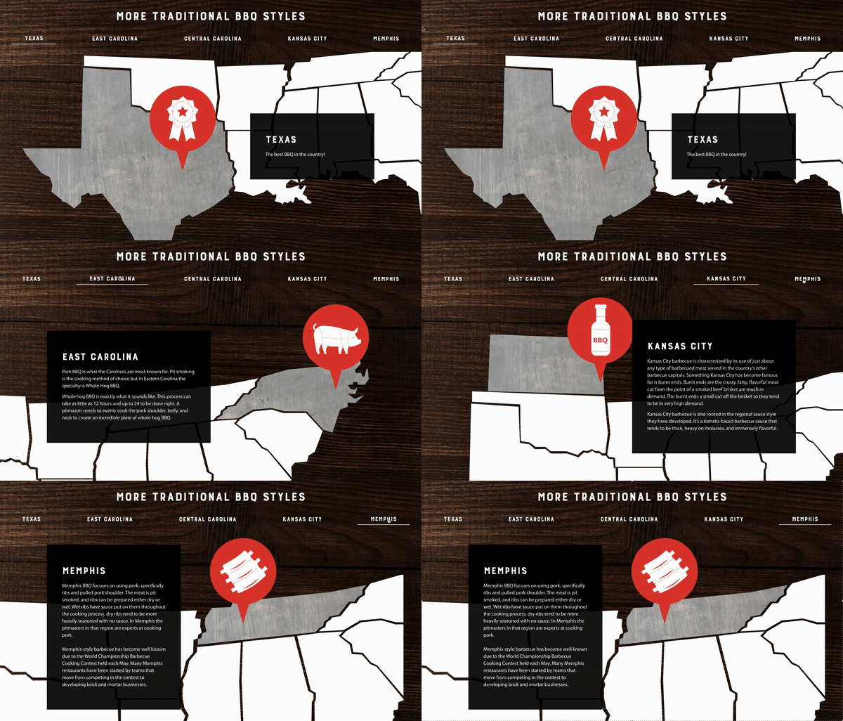
An interactive element was also added at the bottom of the page to show users where other styles of barbecue originated and became popularized. By selecting the locations listed, a popup will give a little explanation of what cut of meat became popular from that location.
Heating Guides
With expertly smoked meats being shipped to hungry buyers, consumers at home will need direction to prepare the meat so it tastes like how it was perfectly smoked and prepared originally. Heating guides were added to help with that cause.
The heating guides exist as their own page on the website as well as a printout that is packaged with the product. Wherever users can get reference for reheating their food is a win in everyones book and in their bellies!

Leaning into Sadler’s new style
Original photography
The original photos of the master smoked meats looked dull, old school, and off brand. Though the brand has a deep rooted history for barbecuing and smoking meats, the execution didn’t give the juicy, inviting, mouthwatering, and eye catching feel that Sadler’s expresses and claims about their meats.
New photography direction
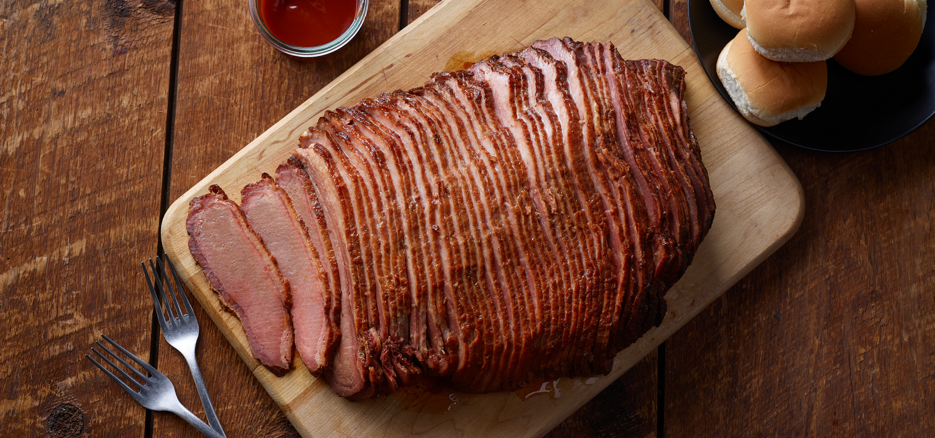
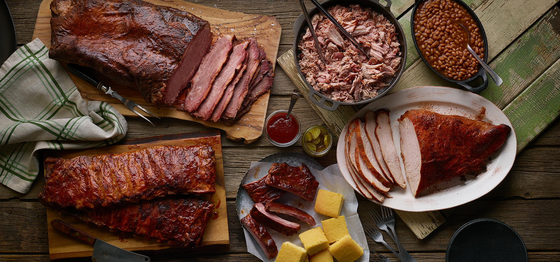
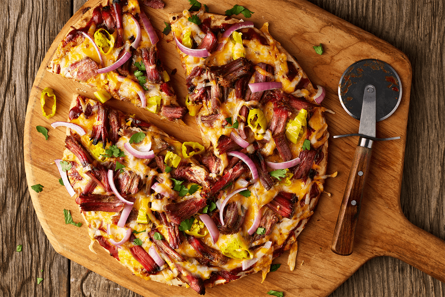
Bringing back the rustic, wooden, backyard barbecue feel paired with juicy and delicious meat ties everything back to the brand’s history and their professionalism for perfectly smoked meat while accentuating the bold dynamic flavors of the brand and how the products are used in their expertly crafted recipes as well.

Bring it home for the holidays
With a fresh new facelift with delicious new photography, Sadler’s was gearing up for holiday campaign to drive sales around the November to December timeframe. One thing that surprised Sadler’s customer base is that they also sell turkey alongside their famous brisket, so they wanted to get the word out!
We started a campaign to promoted their premium turkey alongside their trusty brisket. While promoting their turkey pretty heavily, we wanted to test out a few taglines that allowed the brand to grow their sales as well as showcasing customer reviews to garner interest.
Luckily to say with these variety of taglines and the new scrumptious imagery, the success of these ads reached their target audience and purchases were made left and right off their site. Over the course of the campaign, we made over $26,000 in sales. That sheer amount brought so much excitement to the Sadler’s team and overwhelmed them just a little. Customers also had raving reviews for “Why did [they] decide to buy today”
“Bought a smoked turkey for Thanksgiving. Best I ever had. Wanted something different for Christmas. Brisket looked delicious”
“The only place I could find smoked turkey with beef”
“Just saw ad on Facebook, I had ordered for the fire department…Great food”
“I lived in Houston and I miss Texas BBQ so much I couldn’t pass up the chance to surprise my family with this for Christmas!”
With a new website installed, we were able to boost their sales by 52% as well as bringing life to the brand online and bringing attention to how their products can be prepared in the new “BBQ 101” section on their site.


