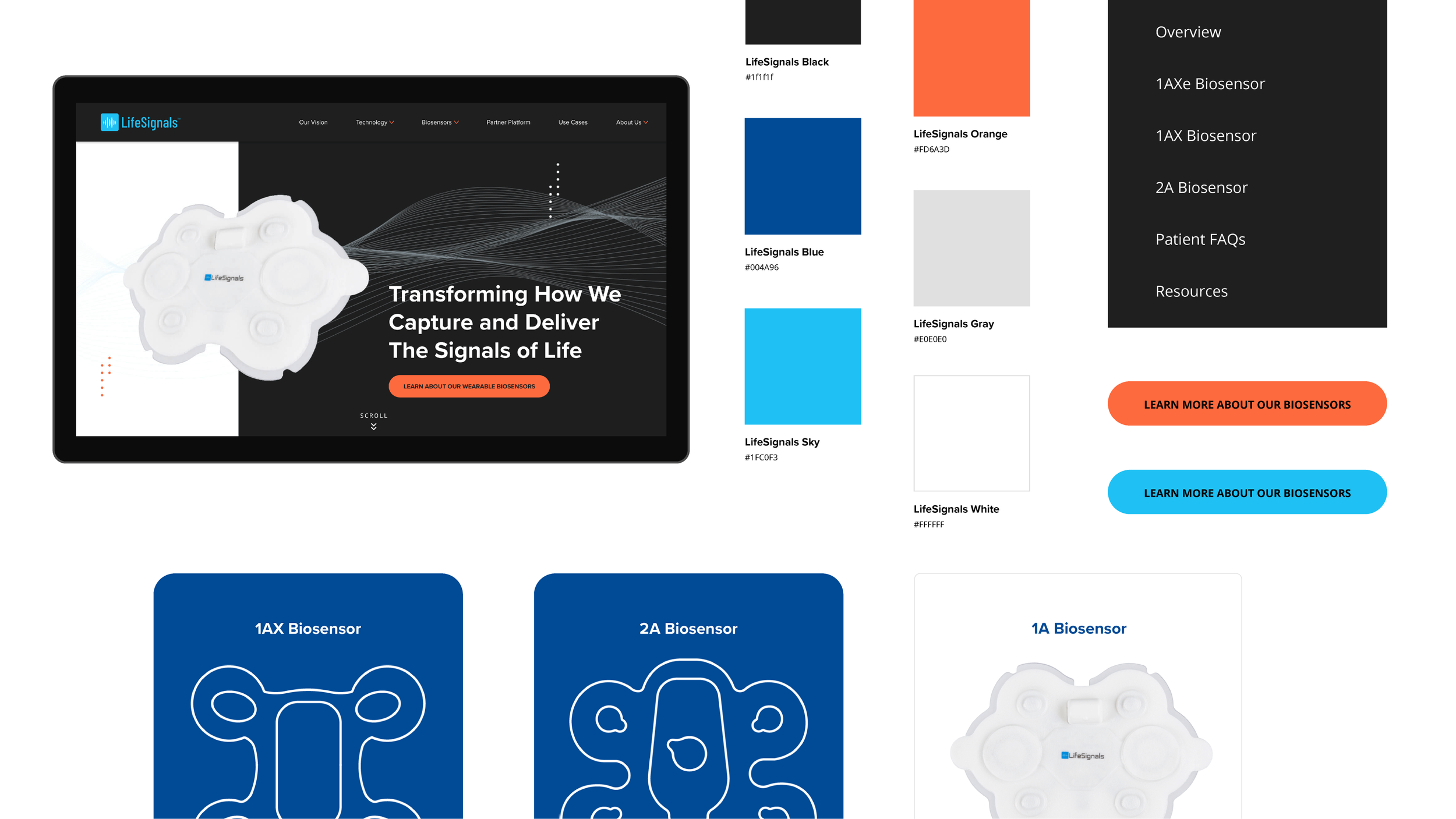
LifeSignals Design System
Project
Website Design, Design System, UI/UX, Branding
Role
Lead Visual Designer
Client
LifeSignals
LifeSignals has an exciting vision for how they can transform healthcare through the universal monitoring of patients using their wireless and disposable biosensors. They are committed to breaking the mold of traditional biomedical monitoring and expanding access to hospital-grade care to all regardless of proximity to facilities or socioeconomic status.
The Challenge
Develop a new brand identity to reflect LifeSignals in a new and transformative fashion.
The Solution
A redefined design system that keeps the essence of traditional healthcare blended with modern future forward thinking for healthcare within a redesign to tell LifeSignal’s vision and complex story.
Let’s take a quick look and analyze
Look at the home page is enough to tell that a revision is needed. For example, images seem disjointed if a user doesn’t know what the brand is about, it doesn’t feel like the page lives up to the modern transformation the brand is trying to evoke, and buttons and icons feel heavy and stark.
The company monitors the health of their clients and makes it accessible through their wireless biosensors. Anyone can wear them in any activity. A quick glance at these images that appear on their home page gives a sense of urgency, fun, and activity but not knowing what LifeSignals is about makes the images feel out of place.
Imagery
Color blocking sections is a great way to show off LifeSignal’s colors but knowing what the brand is about, the images paired with blocks of texts feel uninspiring and lack the innovation the future of healthcare, making the colors feel a bit dull.
Color Blocking
The icons help convey the message the biosensors can do but feel dense and heavy instead of light and on the go, like how the biosensors can make a user feel.
Icons
Seeing how elements in the brand worked together on the original pages of the website in a way that felt stark and cold begged for a new design system that uplifts LifeSignals to show their innovation and thought to push their complex story and engineering.
Color makes all the difference
The look and feel is one of the most important things a person notices first from a brand, and color plays a major aspect in that feeling. Through competitive analysis, we noticed a lot of other healthcare brands alongside major corporations use the color blue as their staple color. “The color blue signals trustworthiness and authority and is associated with well-being, cleanliness, and health.” Taking that into consideration when propelling the brand forward, we wanted to keep the essence of trust and health but add in a twist and simplify the brand to stand out in the best way possible.
Thus simplifying the color pallet and introducing the color orange making LifeSignals more dynamic. Orange is unexpected and provides strong contrast with the color blue. Not to mention orange is, “optimistic, enthusiastic and bold,” just like LifeSignals effort to bring accessible health monitoring to all. Not only this, the colors were tested to be ADA accessible at their respective sizes.
Original Color Pallet
Revised Color Pallet
Changing your type to my type
Not only do the colors get an upgrade but the typeface gets its own facelift as well! The previous typefaces on the site felt default and stock so that needed to change. Proxima Nova was set as headline text for its clean, straightforward, legible, yet inviting feeling it gives while Open Sans was chosen for the body copy because of its easy to legibility and clean look. The fonts convey the trust users can get when coming to LifeSignals.
LifeSignals is an icon
Icons are supposed to be iconic! The icons were redone in a monoline look (with some exceptions) to keep it feeling light and simple. We wanted to represent the light weight, on the go, accessibility the biosensors allow users to have when going about their days.
Move on over, icons
Not only was the icon style redefined, they were implemented heavily throughout the LifeSignal website. A major spot where they are seen are in the hero sections of each page. This is where I got to practice animating my creative and learn the right ways to export each file.
Always moving forward
These LifeSignal waves were created for the brand to represent that the data being received through the biosensors are the signals of life that we can see and monitor. Through twists and turns and any circumstance, LifeSignals is there and will monitor the cases one by one.
Signaling the dots
Dots are shown across the brand as an additional indicator that they are the data points that are gathered and flow conjunctly with the signals from the biosensors. They maybe clusters of information or even lines of insight, but in the end knowledge is power.
Accessible with LifeSignals
Creating this new brand identity brought much more life to LifeSignals and gives them the drive to keep bringing accessible healthcare to everyone. We are merging the digital world with the physical world. With a color pallet that stands out from the rest and lighter features and images that push untethered monitoring forward, LifeSignals thrives.


